Branding for a video game community tournament
I was appointed Creative Director for BPL productions, a company that focuses on community tournaments and a seasonal community league, largely based in the game of Overwatch. My first project was to design branding for the upcoming season of the league, season 5.

CONCEPT PROCESS
The initial pitch for creating a themed branding of this season was an 80's style. A lot of the early reference I found was a sort of false 'retro' visual style that was more an attempt at recreation of the general feeling of 80's imagery - and it all felt a little fake.
I looked instead to actual images from the 80s - particularly magazine advertisements - and used that instead as the basis for the theme of the season. The goal was to allow the designers to create a set of images that almost feel like advertisements themselves, using the format as a lens through which the necessary information about the league can be delivered. For example, one of the graphics that will eventually be necessary is one that highlights particular players for their performance throughout the season. This could be formatted like a Jazzercize poster, posing the in-game characters like the athletes on such a poster.
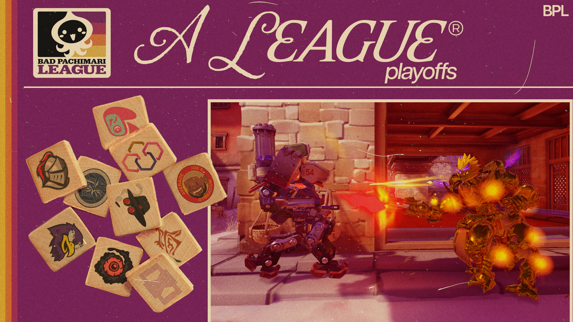
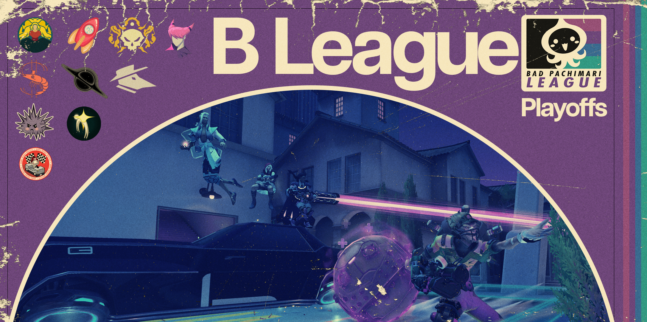
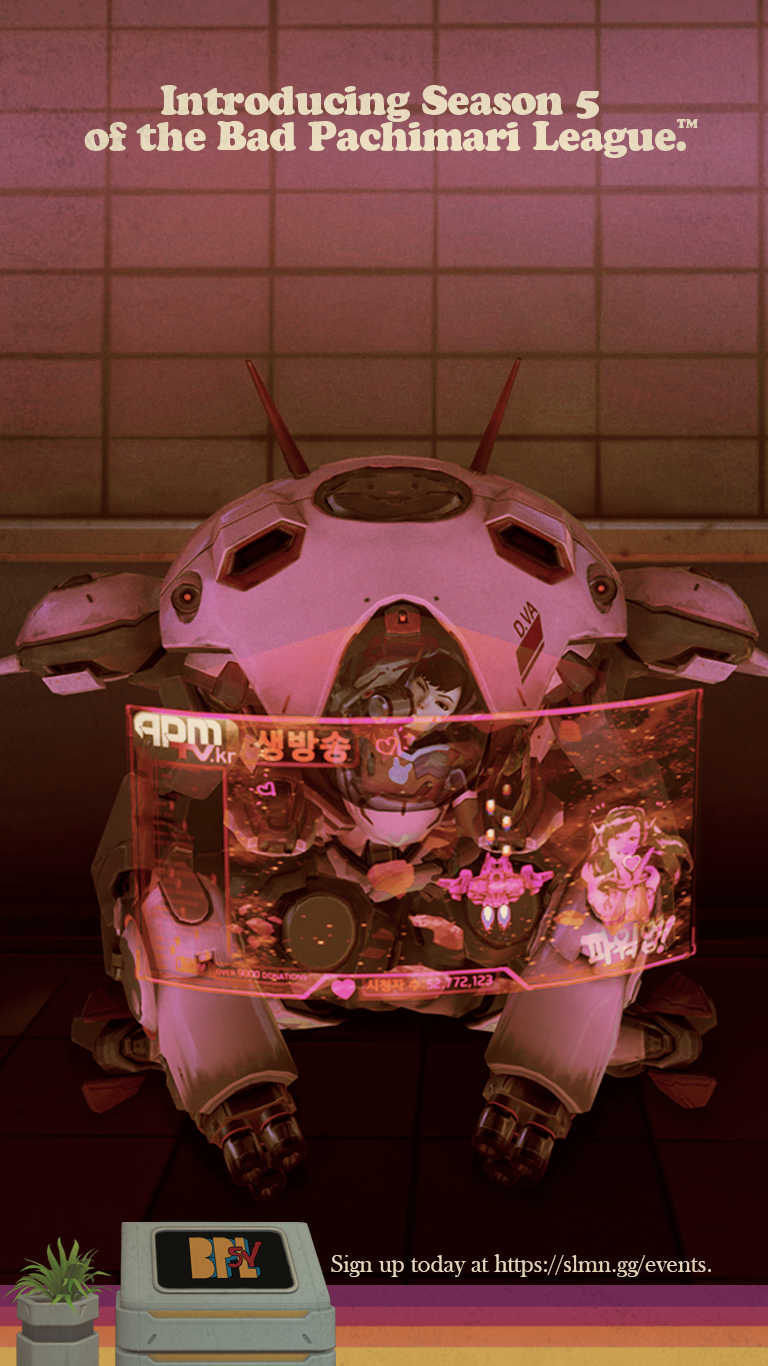
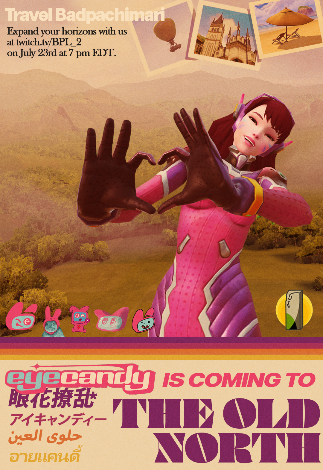
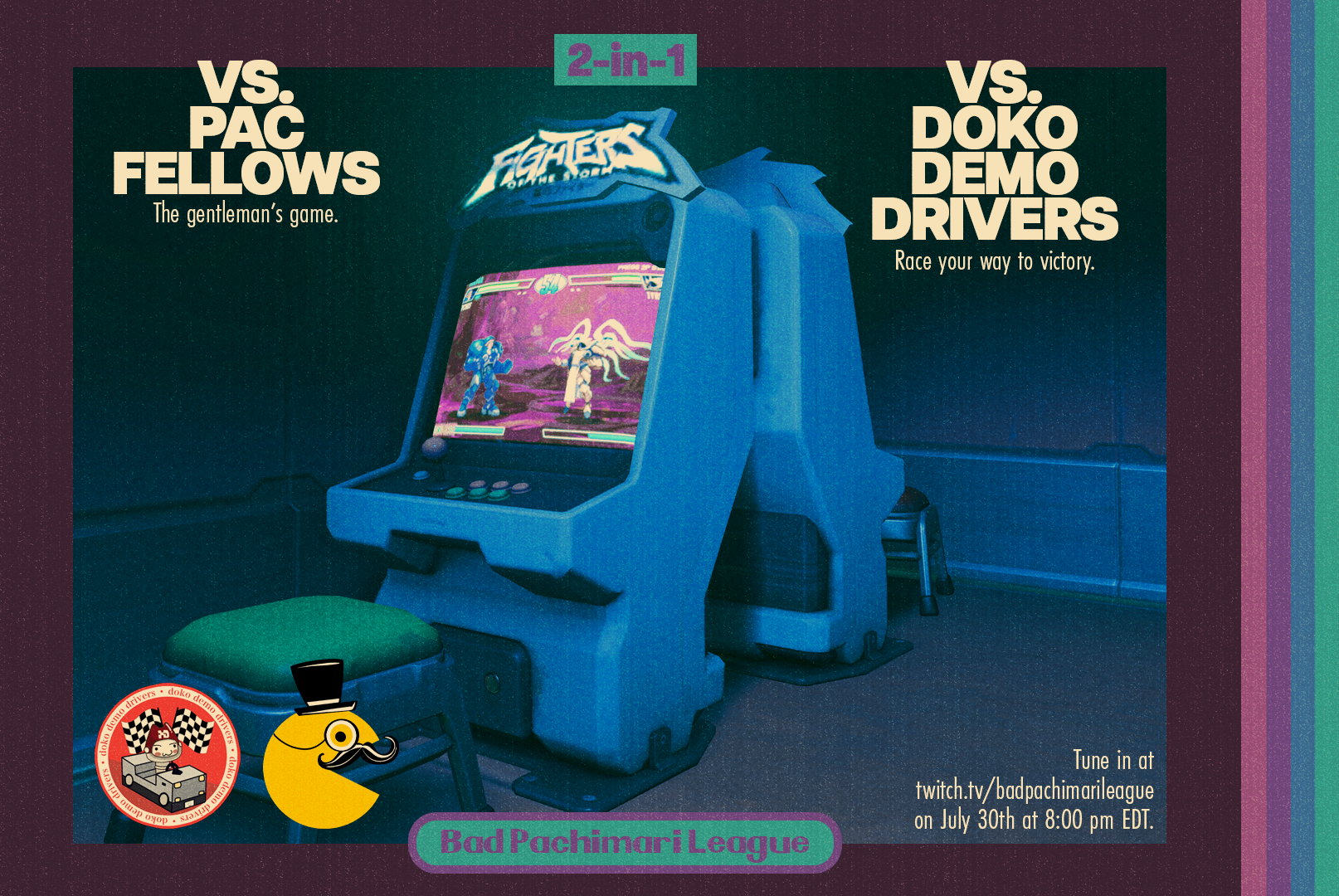
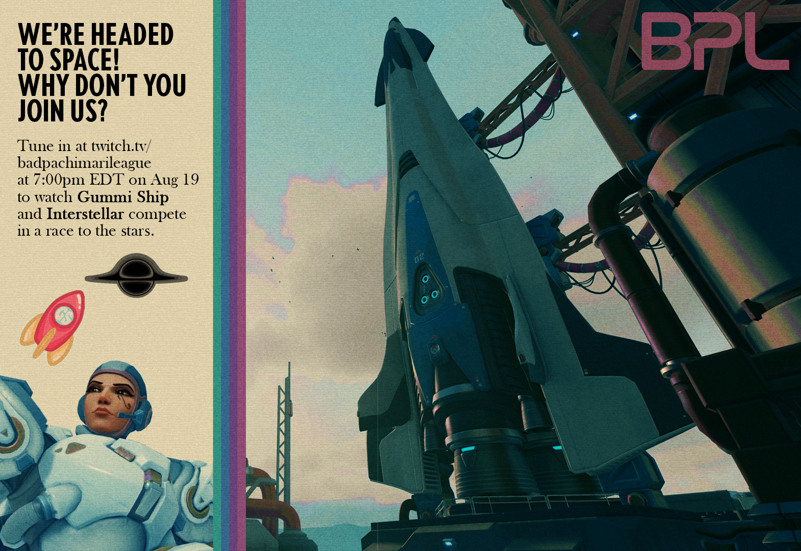
As proof-of-concept, I generated a few announcement graphics, using screenshots of characters from within the game, combined with existing in-game environments. Often times, Overwatch esports related graphics tend to use somewhat random cut-out images of characters placed upon unrelated patterns and backgrounds, so I wanted to focus on using specific character skins and emotes that help to tie into the theme. I artificially weathered these graphics, adding a yellow wash to mute the whites, and film grain effects to dirty them up further. These techniques were then used throughout every graphic I made for the rest of the season.

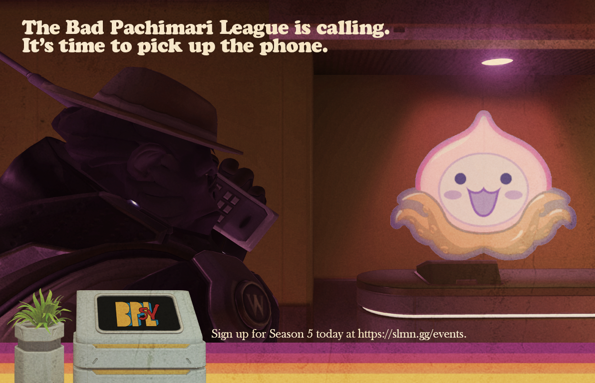
I specifically chose emotes that included older technology, something a little rarer in a game like Overwatch which is set a little ways into the future.
D.va, the character in the first two graphics, has an emote where she plays an old arcade style game using a projection from her mech. Winston, the character in the second two graphics has an emote where he pulls out a chunky old phone - perfectly on theme. The strange tentacled turnip in the fourth image is the 'pachimari' - a toy of some kind in the Overwatch universe, and what BPL (Bad Pachimari League) is named after.
Both sets of graphics have a striped band of colors at the bottom, something I initially thought of just to aid in evoking the 80's theme, but it soon evolved into a unifying element in all future graphics that were produced.
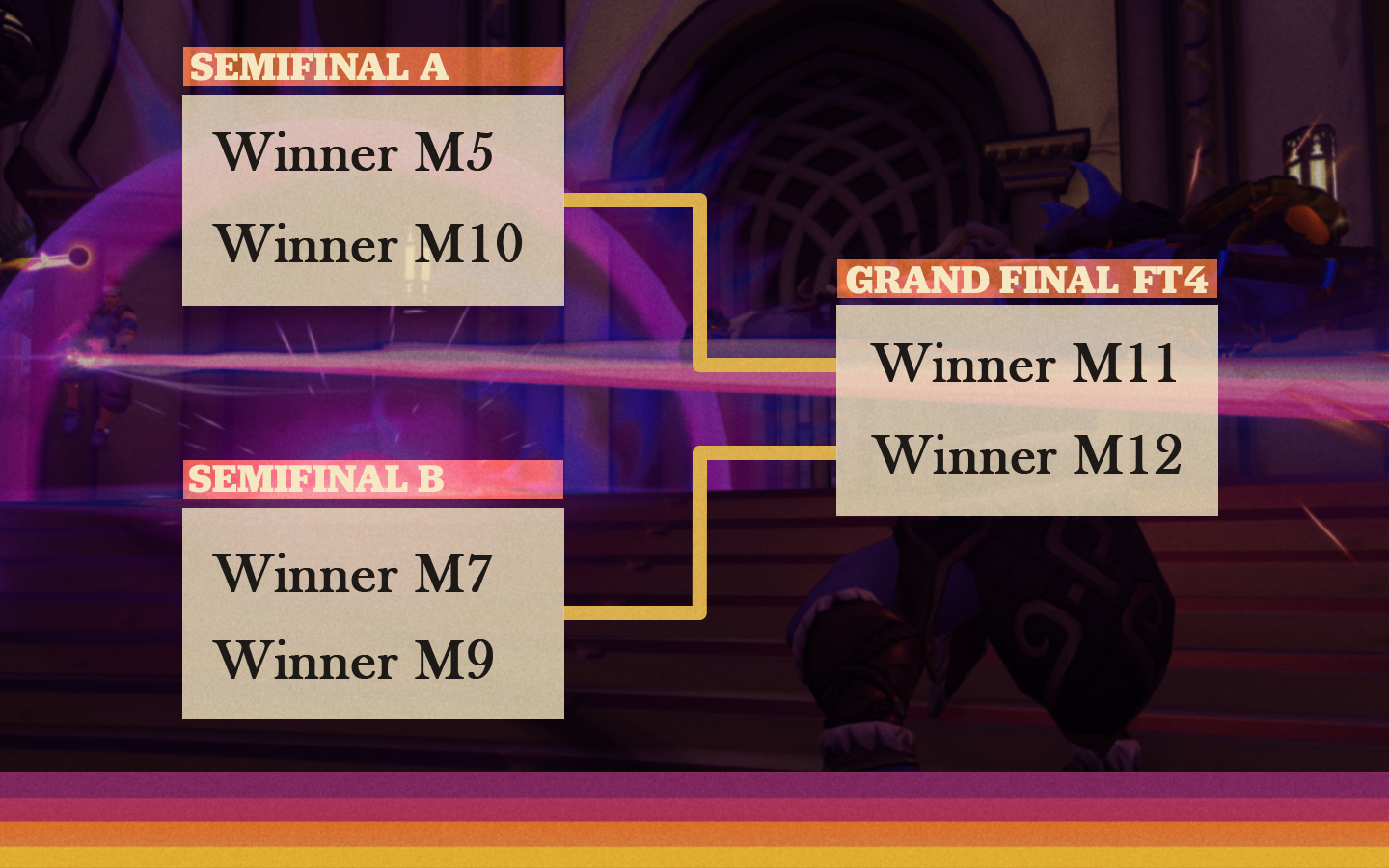
STREAM ELEMENTS
Obviously, an announcement graphic is not the only thing the branding would ask for. This is a production company, one that produces streams that show the matches themselves being played, along with casters and a consistent structured schedule and format.
A large part of the graphics and elements that would need to be designed would be showing up specifically on broadcast. They would need to be consistent and simple enough to be replicated, but not so strict that every aspect of the broadcast looked identical. The above style, involving largely images from in the game, is too specific to be used in this way.
Instead, I created something full of elements that can be easily altered in many ways while still attempting to stick within a style that evokes the 80's (and perhaps that leans a bit towards the 70's too).


These graphics are a little more generic, closer to what Overwatch graphics tend to look like, while still keeping elements from the initial pitch in order to make sure it all feels cohesive and connected. The bold shapes are something that can be shrunken and duplicated, and the grid serves as a simple enough backdrop to place everything on. Both elements can be made to drift slowly, adding movement to the broadcast during otherwise static scenes.
This was also an opportunity to test out different fonts and pick one that could represent the season as a whole.
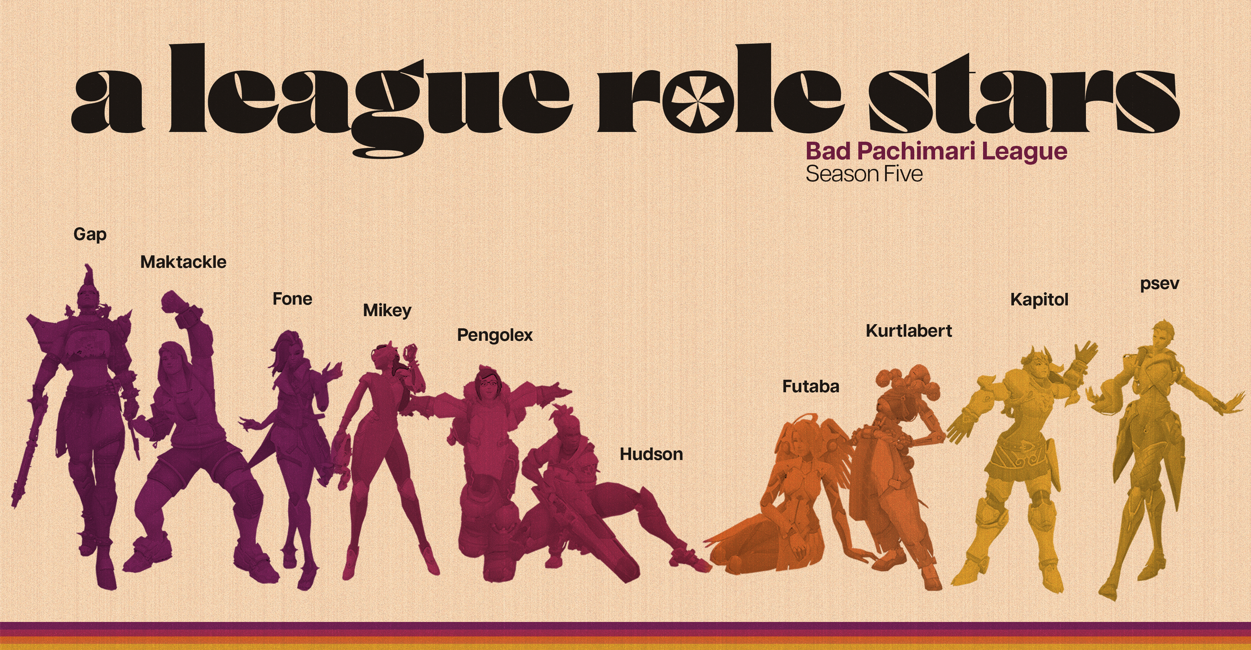
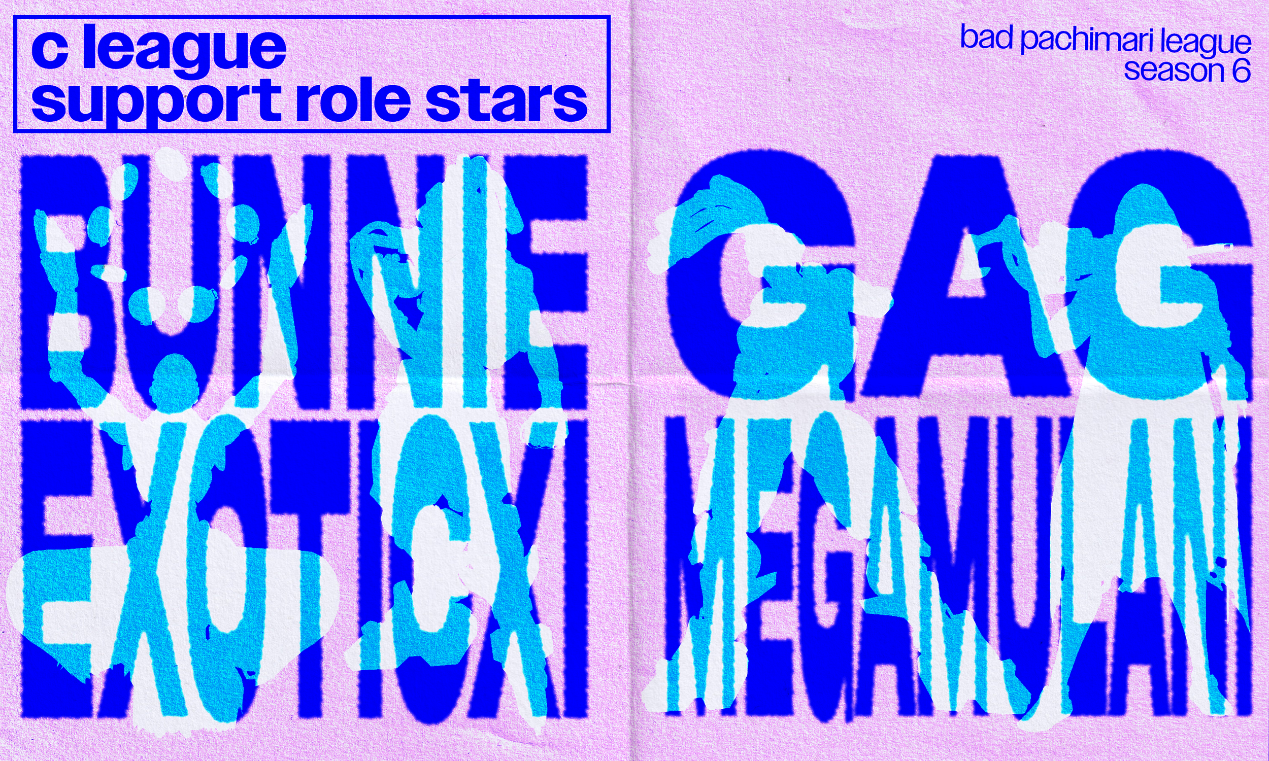
Again, all of this was essentially part of my “pitch” for the season - a first draft at a style guide. Once we were all on board, I designed two more color schemes, as the league was split into three divisions, and I wanted a way to differentiate between them. I then created a style guide, including hex codes for each division’s color scheme (both pre-yellowed and clean) and the divisions associated fonts as well.
The individual duties and projects were assigned to the other designers on the team, and designing the stream package was no longer my job. I was a bit more interested in a specific type of graphic that I had been envisioning from the beginning.
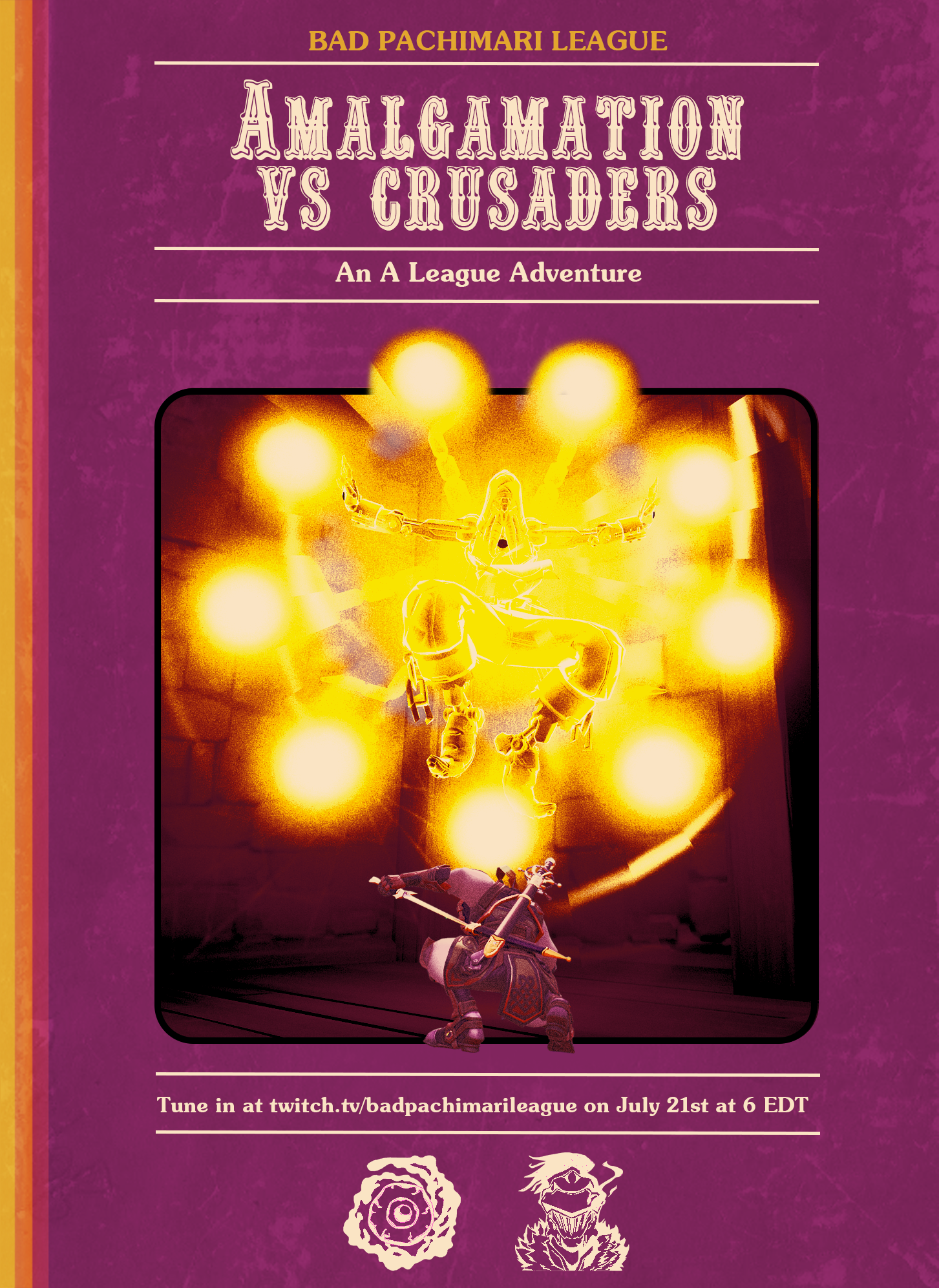
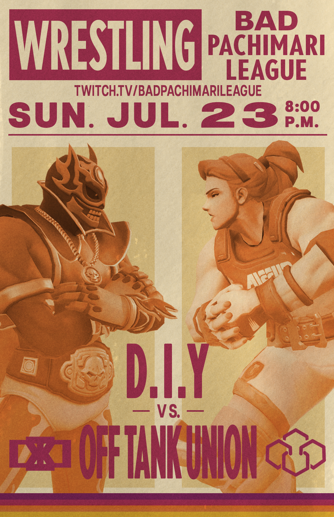
MATCH HIGHLIGHTS
I wanted to really lean into the visual style of the 80’s. From advertisements, movie posters, to even board games and frozen dinners.
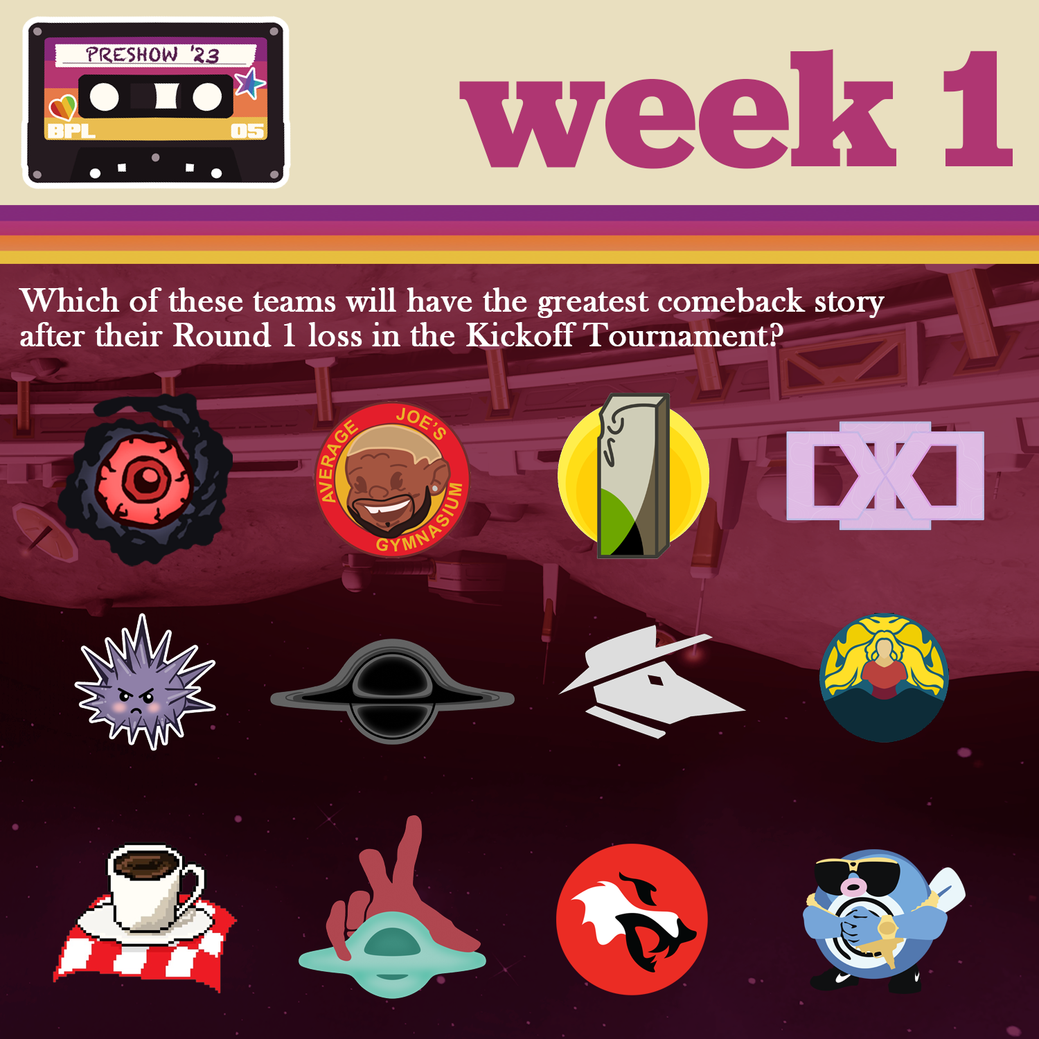
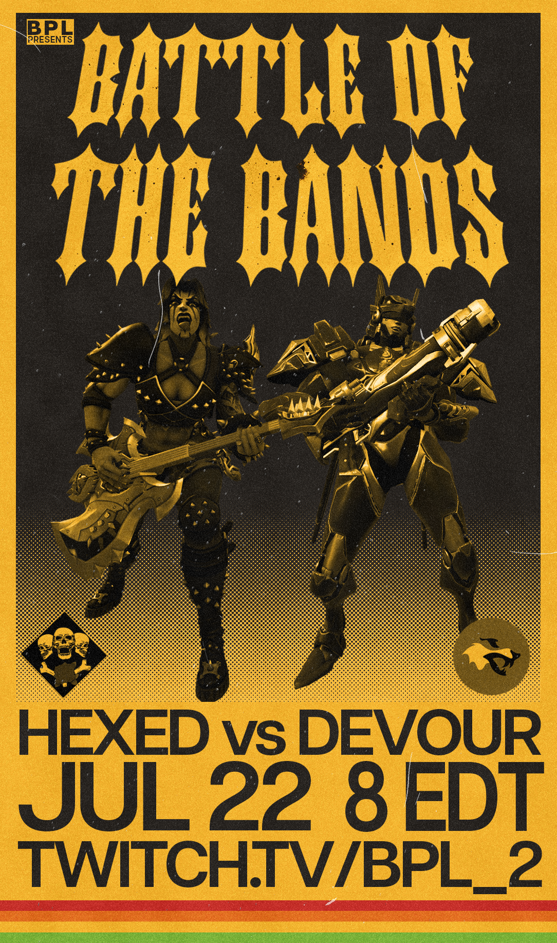
I suggested a weekly set of graphics that would highlight a matchup between two of the teams. Then, using the teams’ branding, I would create a little storyline and find an appropriate poster, advertisement or whatever other piece of design that I could match them to. This lead to the series I had the most fun creating - each piece was a little puzzle, and I loved scouring the internet for inspiration.
Hopefully you’ll be able to recognize some of the inspiration behind these graphics!


MISC GRAPHICS
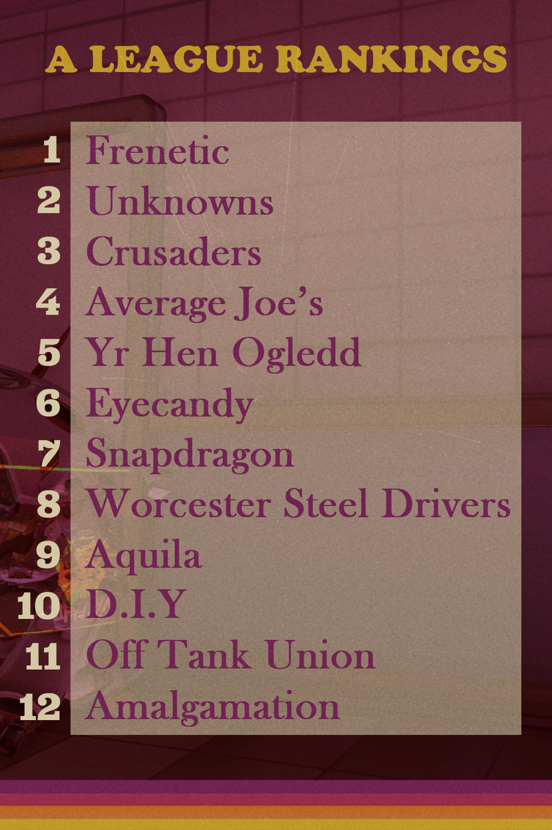
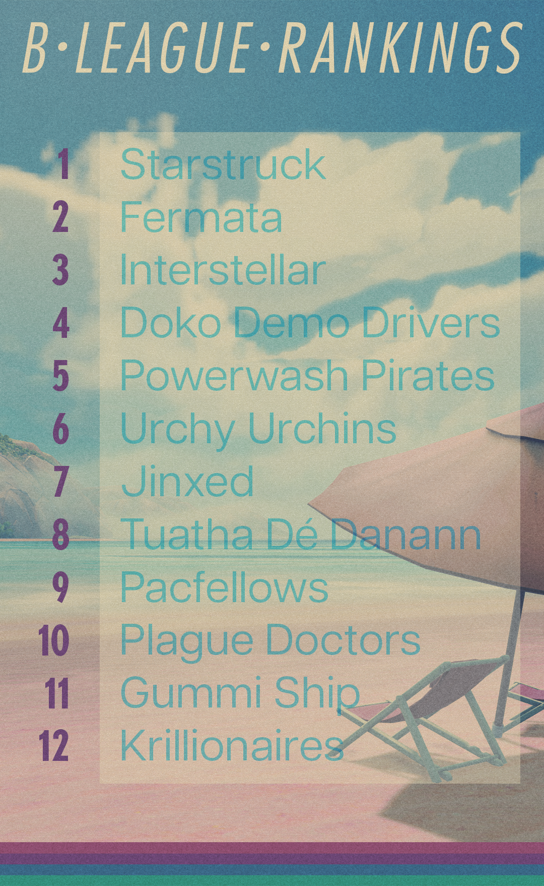
Finally, here are the rest of the graphics I was asked to produce throughout the season and beyond. Some of it was schedule-related, some of it was accompanying graphics for a small podcast-style pre-game show, most of it was general announcement graphics.